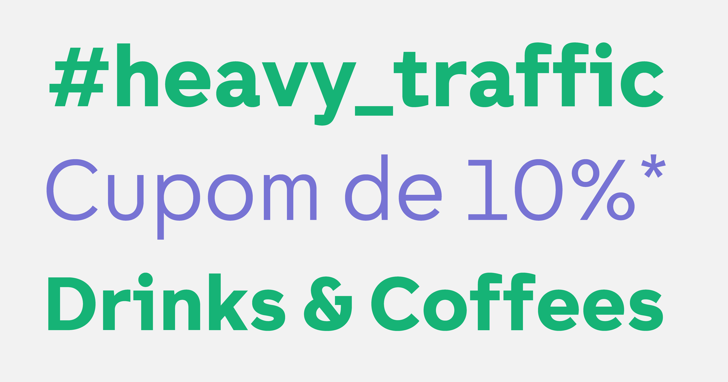


Quicko is a convenience aggregator app. By setting a destination location, the Quicko's assistant combines routes from different modes of transport and presents the most convenient choice of value and travel time. In partnership with Estúdio Passeio, I designed an exclusive typeface for Quicko.
One of the strongest features of Quicko's design comes from its inspiration in the mono-spaced fonts, present in both typewriters machines and codes behind the most innovative digital products. Narrow letters like ‘I’ gain serifs, and wider letters like M take up less horizontal space. These decisions, in addition to contributing to a dynamic and relaxed appearance, insert the family into the typographic universe of technology companies.
Client
Quicko
Creative Direction
iN - Consultoria de marcas
Year
2019
